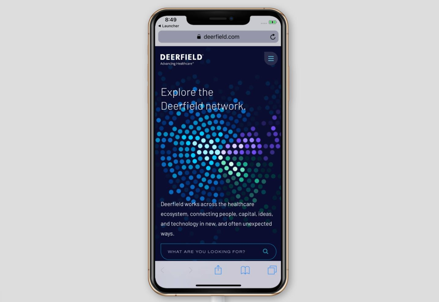
Building a dynamic content discovery experience with hundreds of creatively animated, interactive dots.
Deerfield is an investment management company with a focus on healthcare - with hundreds of articles on their website for visitors to browse and discover. The challenge that presented itself was how visitors would find content, and how to display it to promote discovery. The user experience had to guide users towards key content, while also keeping it well organized and fluid enough that you could explore in many different ways.
This project entailed taking an agency's design files and working alongside them to develop a reactive component that was visually interesting, while also performing well across a multitude of device capabilities.
As you’d expect, a bunch of math went into place to calculate where each dot would land, and how they animate across the screen. HTML5 canvas was used to render the layer, with hit tests that trigger modal pop-ups surfacing more details on each content item.
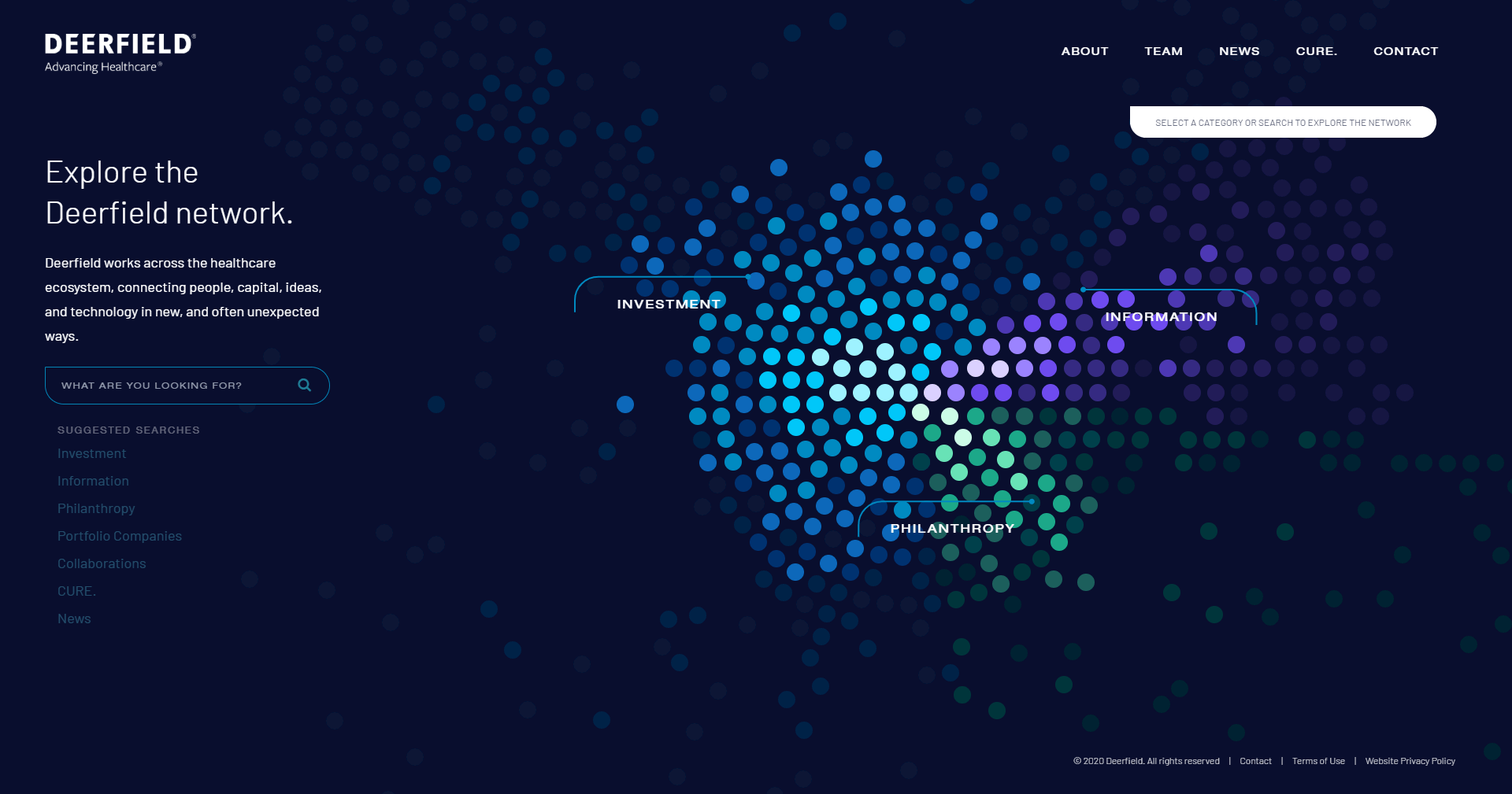
Content was drawn to the screen in concentric rings, with each dot representing a single content item. These items were color-coded into one of three categories, and their distance to the center of the diagram (and the brightness of the hotspot) was determine based on the content’s relevance.
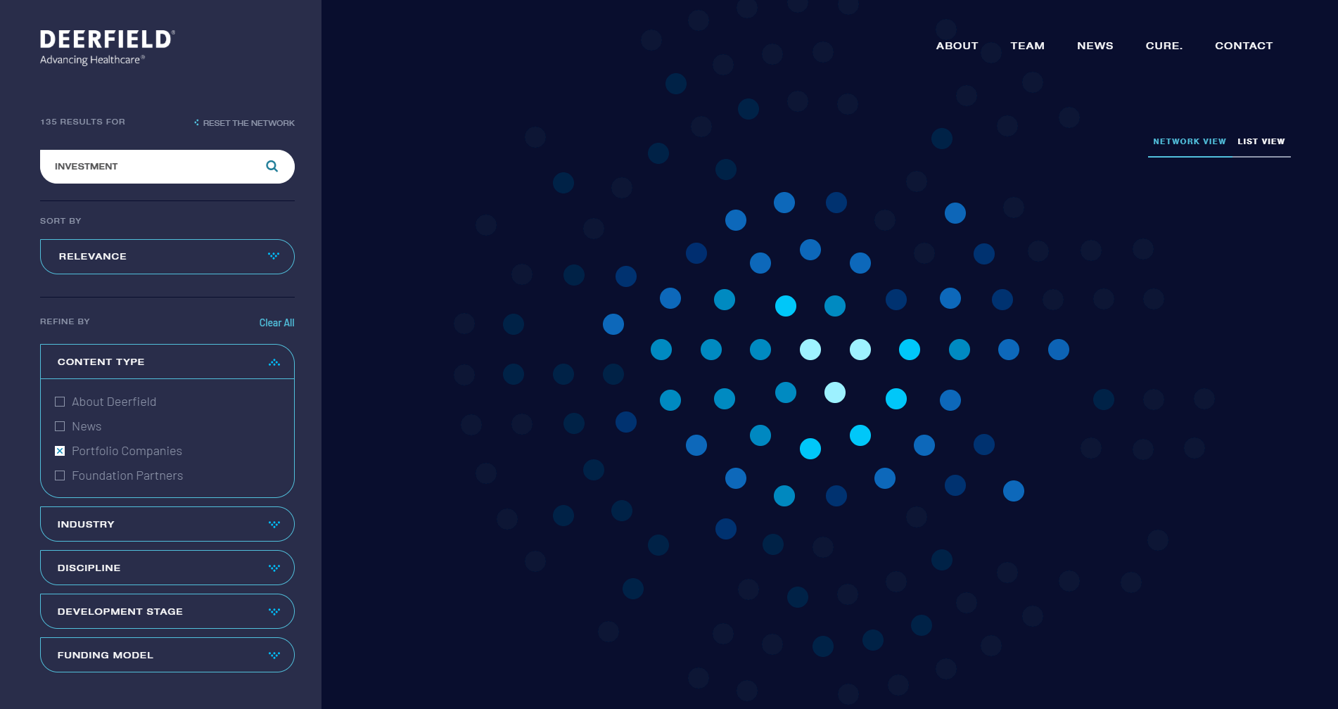
This functionality was extended into the search feature. When a user enters a search term, or clicks on one of the three main categories of content, the network will re-arrange and filter itself to show the most appropriate content front-and-center. Search itself was implemented using SwiftType.
On the initial load, we wanted a full introduction animation before the network comes together to form their core values. This process involved not only working to simultaneously load data and swap out psuedo-elements, but a custom SVG filter was developed with some clever trickery to allow the dots to "blob" together when near each other, creative an intriguing fluid effect.
Performance was key, so the experience was extensively tested on a variety of mobile devices. We were constantly checking frame rate, animation speeds, hit boxes, and more to ensure a consistent and enjoyable browsing experience.
The final component provided for a robust and navigable user experience that allowed visitors to quickly find what was relevant to them. By implementing this system, Deerfield has improved the overall user experience for their visitors and increased the discoverability of their content.
"This is awesome! Nice work!! Thank you so much, we appreciate your help pulling this together.
Copyright © 2024 Marchant Web, LLC. All rights reserved.